NetNames, a leading provider of global brand protection and internet domain name management services.
The Brief
NetNames wanted to take a disparate campaign identity and wrap it within a cohesive yet flexible visual identity which could be applied successfully across all channels and communications.
The Solution
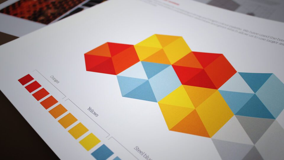
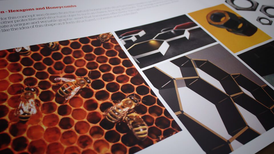
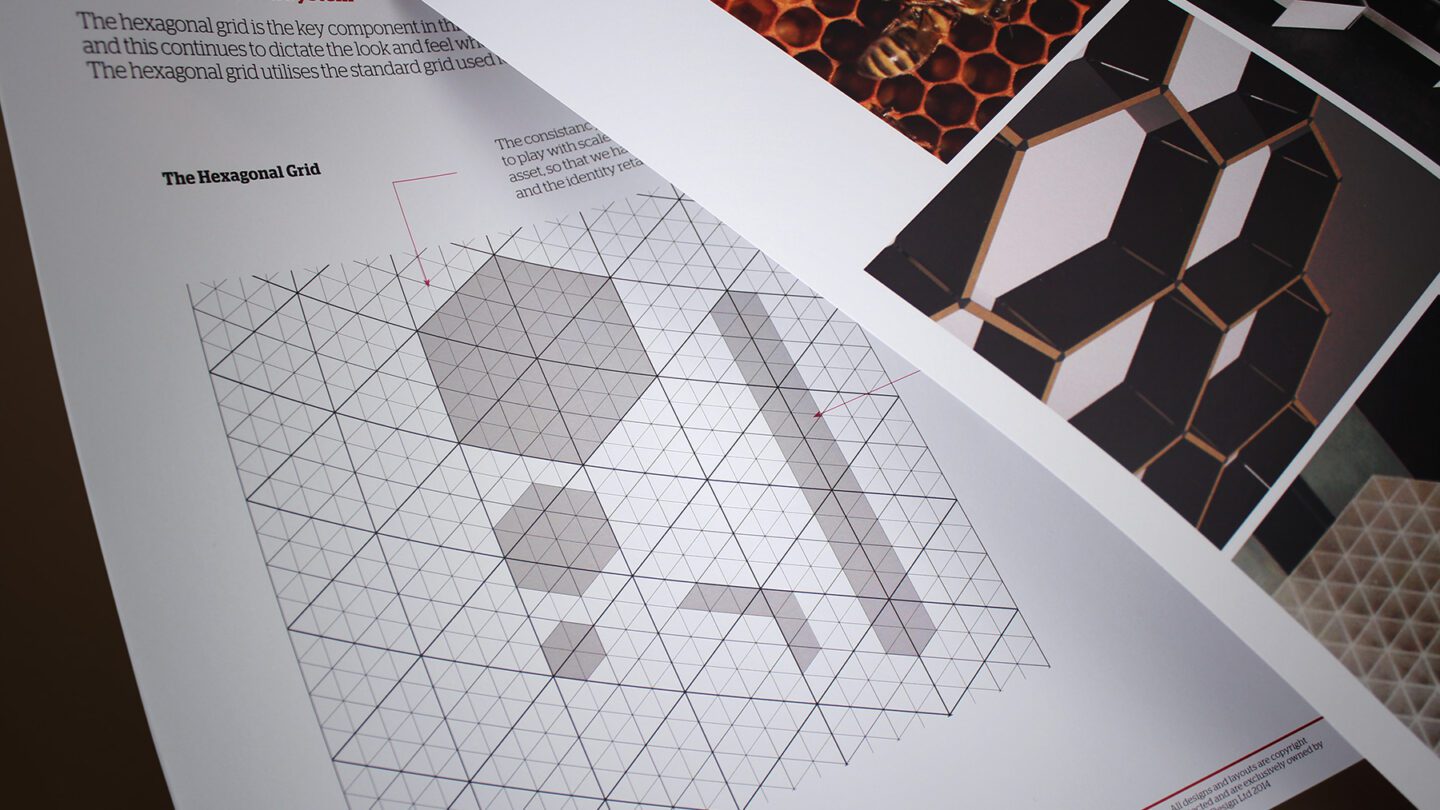
NetNames’ existing identity used the colour orange yet its use of visual assets lacked consistency and a greater brand narrative. We capitalized on their existing positive reputation for protection and strength, by developing an associated positioning which supported this key brand promise. We researched deeper to organised systems within nature and struck upon the hexagonal nature of the honeycomb. We noted the connection with the legacy brand colour as well as the potential visual cue of multiple moving parts within a greater ordered structure. We viewed the hive as a metaphor for the online world of digital asset management. We developed a unique hexagonal grid system which we used to create a visual toolkit, as well as unique iconography and custom illustrated infographics. The sum of these assets formed a holistic yet flexible digital brand identity. We then extended the existing colour palette and wrapped up the brand in a comprehensive set of guidelines.
The Results
The digital brand identity process enabled NetNames to increase their brand equity prior to selling the business to CSC, a US-based, leading provider of business administration services to corporations.
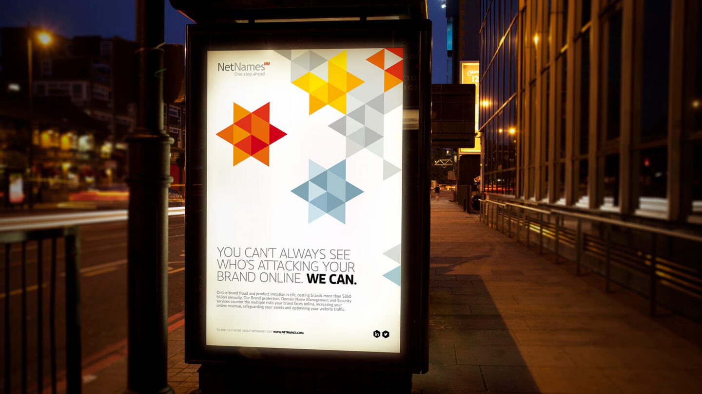
Our inspiration was drawn from the natural honeycomb structure bees create to protect their larvae.
Our early conceptual reflections entertained communicating strength through bold, visceral imagery.
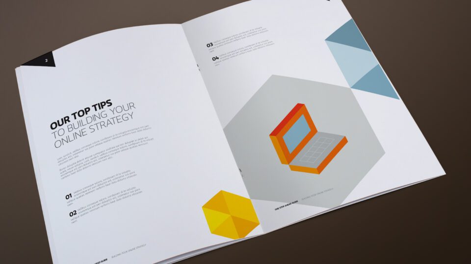
We created a flexible hexagonal grid which constrained the identity to particular angles, forms and functions.
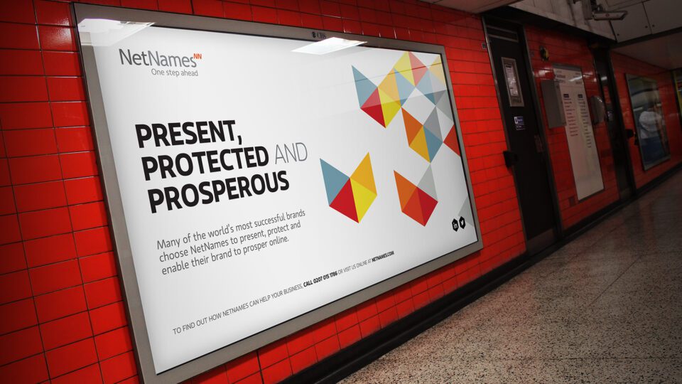
The brand became instantly recognisable in low intensity situations.
The visual identity works hard on its own, without the need of the brand mark.
We created a brand library which enabled internal staff and other third parties to extend the language into day to day communications.
Working with the brand paradoxically lends itself to the creative usage of an established system and set of rules.
The flexibility of the system allowed us to create a myriad of different brand illustrations and assets.
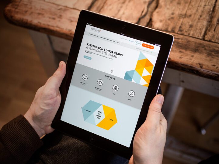
The simplicity of the visual devices render beautifully in the digital environment.
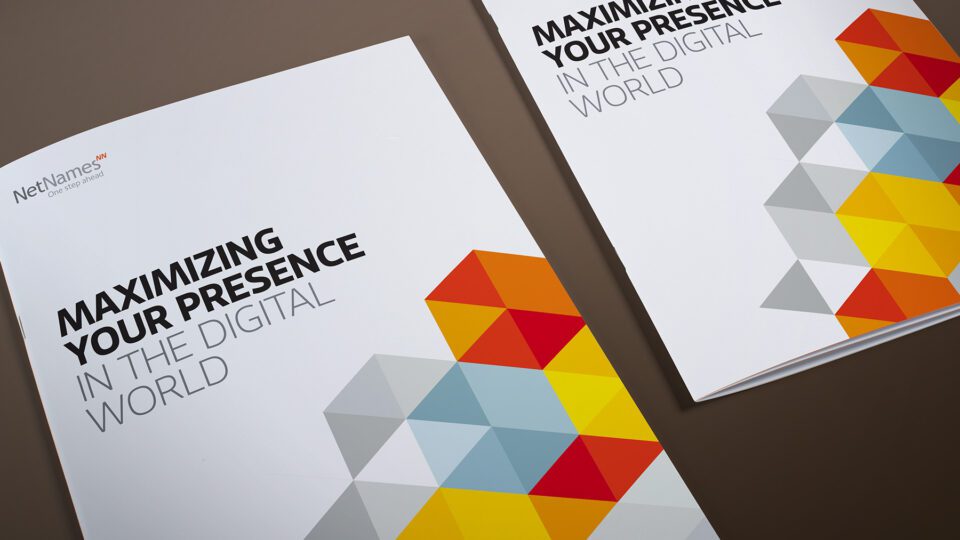
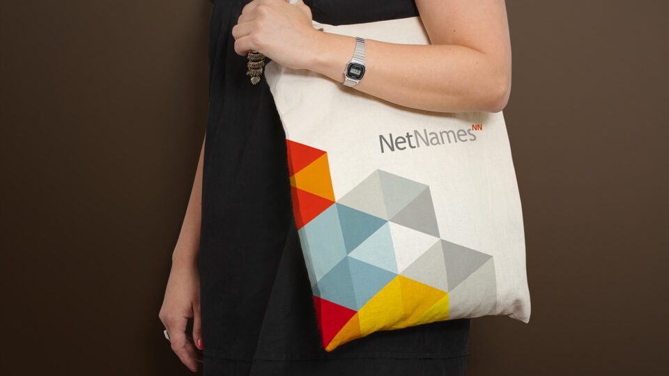
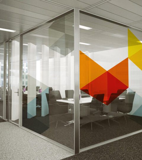
The visual identity extended across the entire brand. We developed a custom toolkit of infographics which would be used in communications.
We created a unique brand identity system created from a series of building blocks, paired with bright colours and contemporary type.
The brand identity enables NetNames to create brand stories using unique and quirky iconography which links to various positioning statements.
The combination of structured graphics, bright colour, white space and clean typography immediately creates a premium contemporary aesthetic.
Our inspiration was drawn from the natural honeycomb structure bees create to protect their larvae.
Our early conceptual reflections entertained communicating strength through bold, visceral imagery.
We created a flexible hexagonal grid which constrained the identity to particular angles, forms and functions.
The brand became instantly recognisable in low intensity situations.
The visual identity works hard on its own, without the need of the brand mark.
We created a brand library which enabled internal staff and other third parties to extend the language into day to day communications.
Working with the brand paradoxically lends itself to the creative usage of an established system and set of rules.
The flexibility of the system allowed us to create a myriad of different brand illustrations and assets.
The simplicity of the visual devices render beautifully in the digital environment.
The visual identity extended across the entire brand. We developed a custom toolkit of infographics which would be used in communications.