We have created a sixty page Integrated Annual Report (IAR) for keystone Cape Town client, Sygnia. The design of the publication is the precursor to a full identity refresh for the brand, and has laid the foundations for the new more refined design principles to follow.
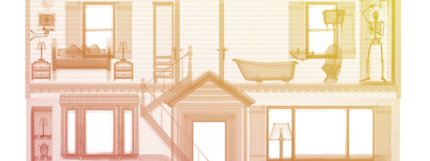
With over a dozen various sections, and a fluid content timeline – it was vitally important that the publication followed best practices in logic and structure. With the improved structure came a refreshed interpretation of the Sygnia X-Ray brand imagery, using softer colours and gradients.
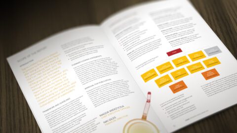
The new design language features delicate linework, combined with a bright vibrant palette
Design control
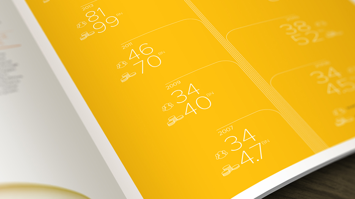
The release of the publication kicks off a process of a full publications audit with the view to creating a guidelines kit to control the entire publishing remit of the business. A typographic hierarchy has been established, together with controls for tables, infographics and numerical data. The controls are to be applied to a myriad of formats as well as structures for both print and digital.
The release of the publication kicks off a process of a full publications audit

Enhanced visual identity
The X-Ray imagery, created by Nick Veasey, is used in primary spaces on colour grounds, and in secondary areas as a soft colour gradient on white. This represents an evolution of the original brand identity created over 10 years ago, also by firedog; and whilst it is markedly different, it still pays homage to the original idea of playing with both positive and negative colour spaces.