Firedog has created a bright and geometric brand visual identity for a leading Cape Town firm
Greenpoint is a specialist private credit investment management firm that has been providing credit led capital solutions to Southern African mid-market corporates for over a decade. The team engaged with the Firedog Creative Cape Town studio with an objective of evolving their brand to an elevated and internationally focussed positioning. The business operates with a very tight niche and expertise across the local and sub-Saharan territories. This asset class specialism combined with local expertise becomes the core positioning which acted as a lodestar to the strategic brand effort.
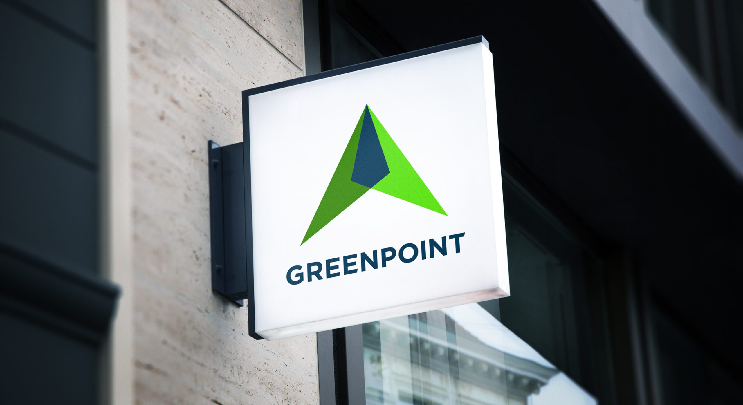
The brand symbol device harnesses upon two primary concepts. Firstly, a geometric arrow device pointing upwards, much like a compass point orientating true direction. Secondly, the colour and form creates a mountain like device inspired by Lion’s Head – A well known landscape feature which overlooks the Greenpoint suburb of Cape Town (and the founding place of the business, which led to the naming of the company.)

The Greenpoint Capital logo
The supporting visual identity utilises a performance sports metaphor which ties into the notion of investment preparedness and dogged determination. The colour palette is restricted to tones of the original blue and green symbol images in order to create a unified and contemporary feel. We have delivered the branding, visual identity, PPT template, internal documentation templates as well as providing the design and build of a corporate website built upon the Elementor platform.

The Greenpoint capital website homepage indicating the visual identity expressed through colour and imagery
To find out more, please view the full financial services branding case study for Greenpoint Capital

