Firedog has recently completed a full rebrand for top Lloyd’s of London insurer, Neon Underwriting. We were very fortunate to work with a very brave, visually driven client; and the results are evident of a bold business striking out, challenging the status quo.
Firedog worked together with Brighton based agency Fable&Co in delivering both strategy and creative. The sizeable project began with a research program which defined the brand’s objectives. Research included a workshop as well as a series of one-to-one interviews. It became apparent that the business faced a challenge with visual parity within the competitive environment.
Built through research
Once the research was completed, we set about drafting a comprehensive strategic framework. This toolkit comprises recommendations on the findings garnered from the research process and establishes vision, mission, values, proposition and positioning for the new brand. In order to deal with the brand parity, and specifically in relation to the Lloyd’s physical marketplace, we looked to define a unique and contrarian brand identity system. The corporate identity became intrinsically linked to the brand name, Neon. All the values of Neon (Bold, bright, fluid) became the values behind the brand proposition.
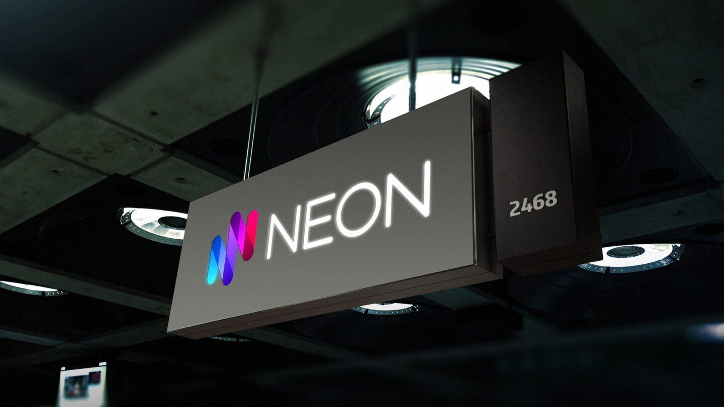
The corporate identity became intrinsically linked to the brand name, Neon.
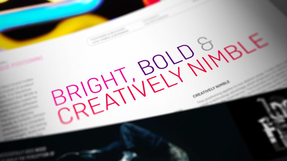
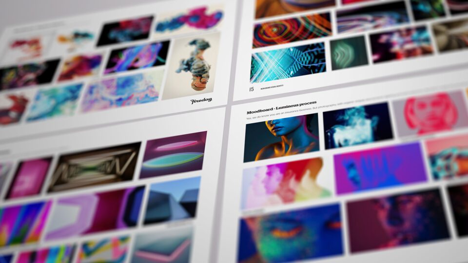
The strategic framework is made up of a colourful 22 page document which addresses the corporate identity positioning via visual language and metaphorical constructs
Creative positioning
We established a metaphorical connection between these values and creative executions of brand, look and feel, messaging and tone. The brand process was based on a rebrand, which is a situation where a legacy brand is “binned” and refreshed with a completely renewed proposition. It was an exciting process to take an expected, dull insurance brand and give it a whole new lease of life.
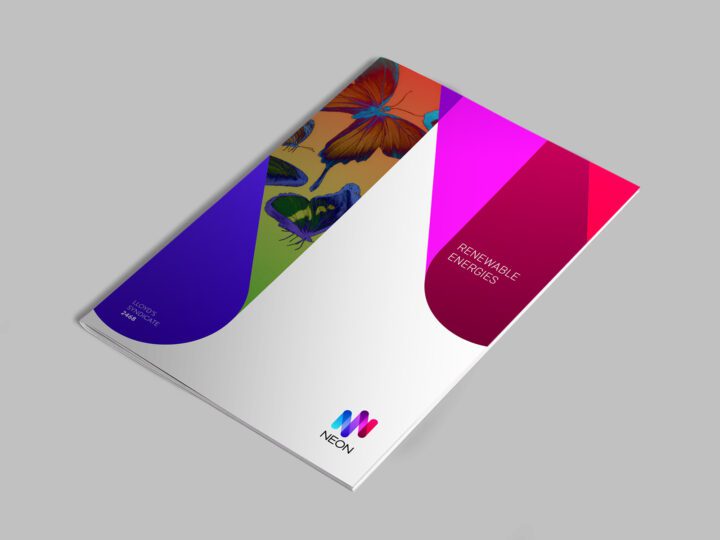
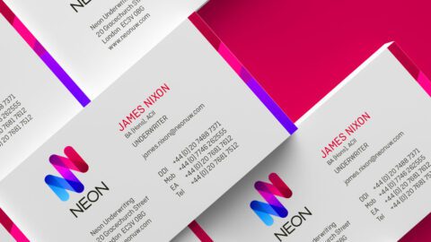
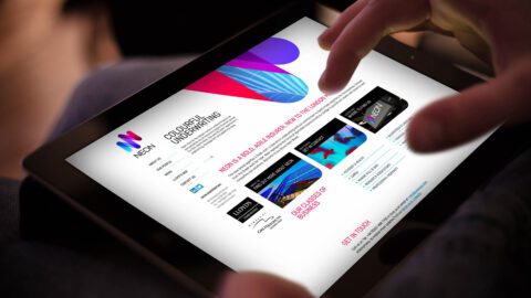
For the brand mark, we looked to the visual properties of Neon and rendered it into a simple yet bright Neon symbol. The type mark, which was custom made out of geometric forms, is itself tubular in nature. The colours were chosen, specifically for their very bright nature, and the fact that the usage of cyan / blue and magenta / pink meant we could exact the same amount of vibrancy in print as in digital.
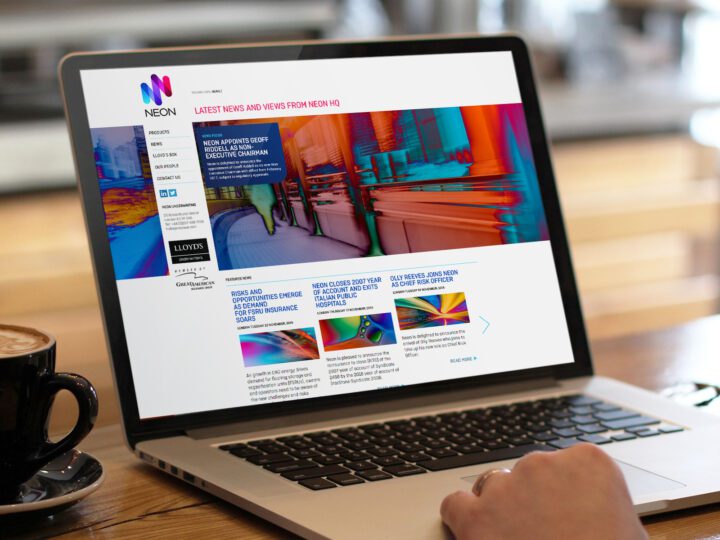
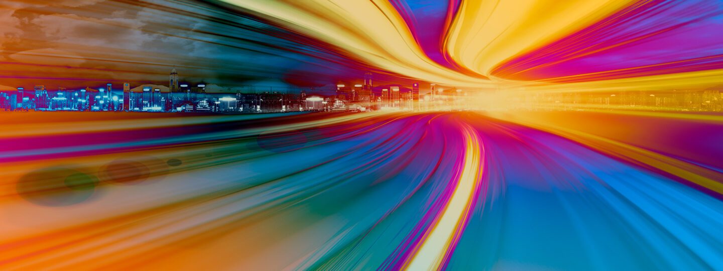
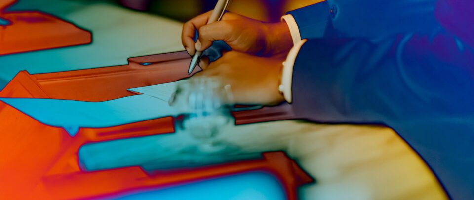
The visual identity is supported by unique imagery which we custom post-produced with a unique branded effect.
Visual identity
The visual identity itself is constructed of “tubular” shapes, which have been extracted from the brand symbol. These shapes are arranged and cropped in varying forms in order to create a striking yet flexible system. The visual identity is supported by unique imagery which we custom post-produced with a unique branded effect. We realised that the appetite for shooting new imagery was limited. So therefore, we took existing established stock and “corrupted” it with a new shocking Neon feel. This is quite fun, as the design team could take a very banal image and completely transform it with some clever imagery processing. The main step was to invert the colours to create a “film negative” effect. This was followed by a reversal gradient and a number of other grading techniques.
Rounding off
Finally we used a retro-bauhaus typeface, Ciutedella Rounded, to bring the messaging and imagery together in one cohesive look. Due to the bright nature of the subject matter, we anchored the identity in plenty of black and white, with an abundance of white space.
The brand identity has proved to be very popular, creating both instant stand out and a vibrant buzz in what is seen as a very institutional market.
The identity has caused instant stand out and a vibrant buzz in what is seen as a very institutional market.