the client
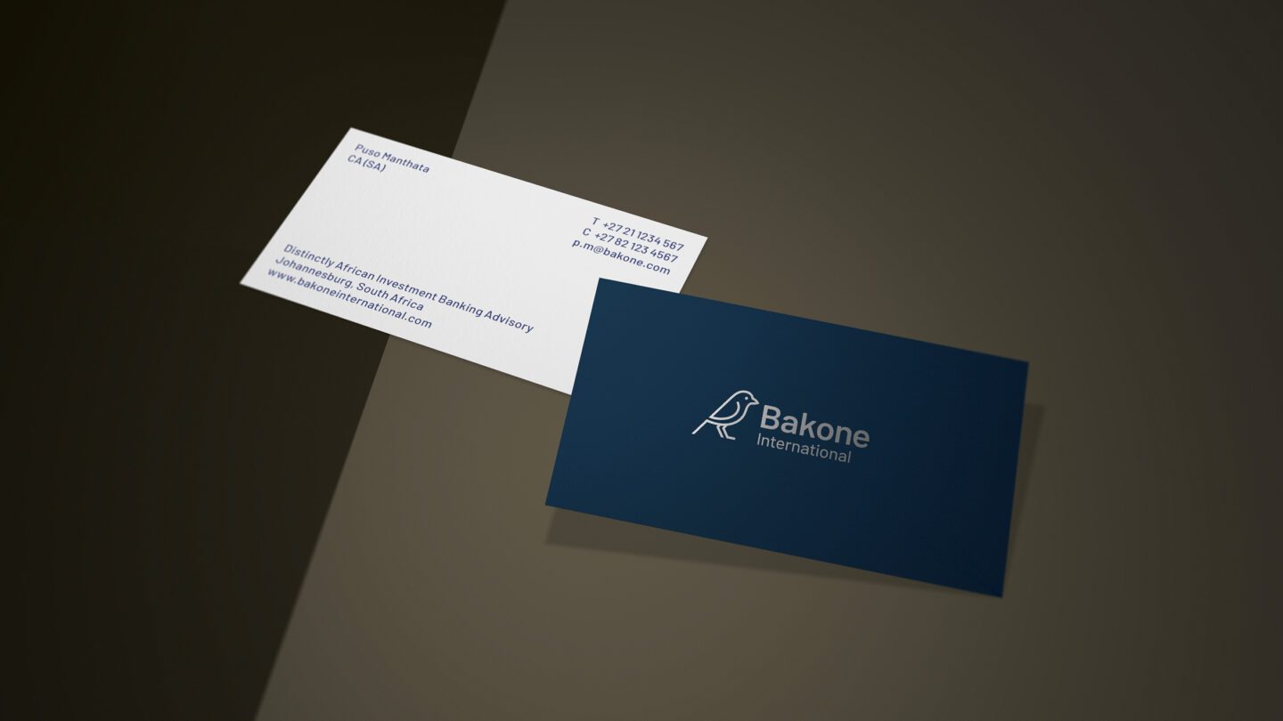
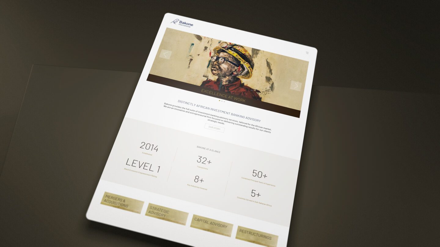
Bakone International is a distinctly African Investment Banking Advisory providing the full suite of investment banking advisory services, tailored for the African market.
The Brief
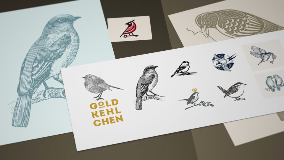
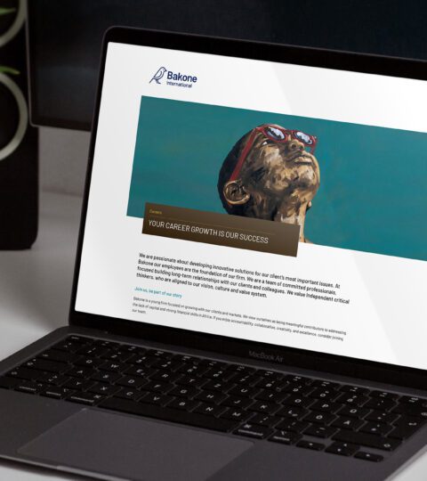
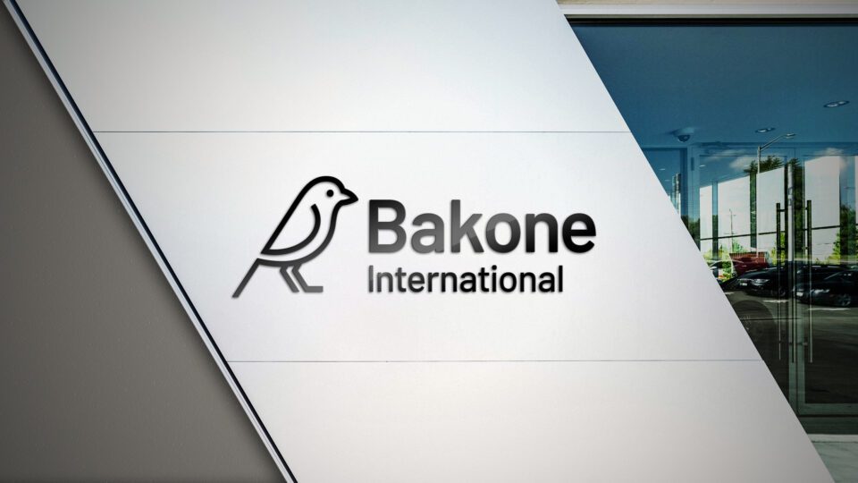
Firedog was commissioned to develop a growing financial services brand in Southern Africa. Bakone international is an innovative and entrepreneurial firm focused on delivering outstanding results for our clients strategic needs. The business has distinct and first rate local knowledge. Our task was to elevate an existing brand identity into the contemporary business world whilst maintaining a strong African feel. We were briefed to retain the existing brand heritage if plausible. We did enjoy the unassuming nature of the scaley feathered finch icon which existed - it offers a contemporary spin on what is often seen in iconography; overly masculine and bold brand animals. It also has a heritage connection to the founder's northern roots which we felt brought an authenticity to the symbol.
The Solution
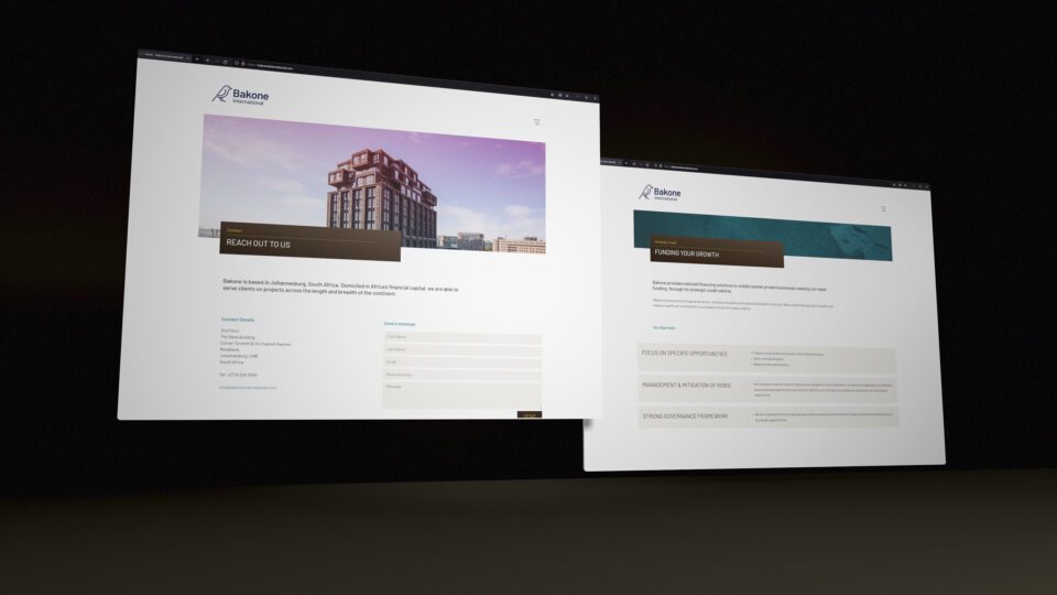
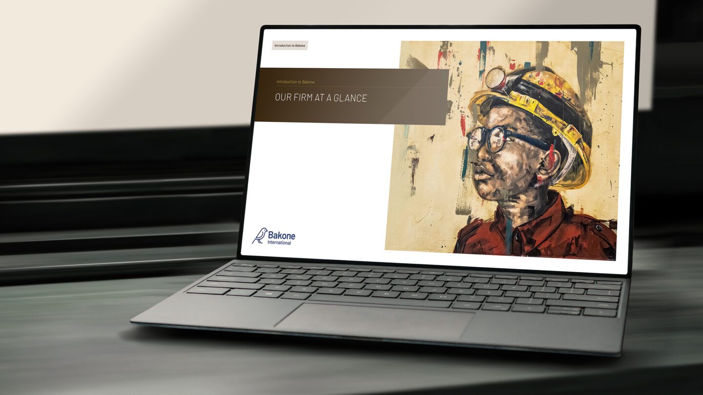
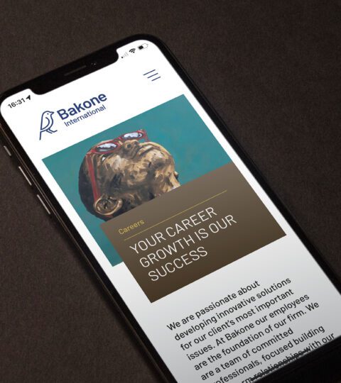
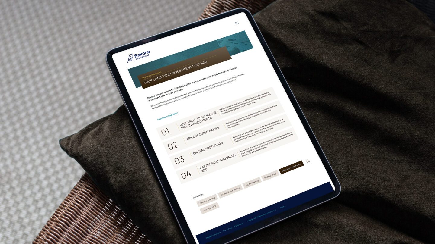
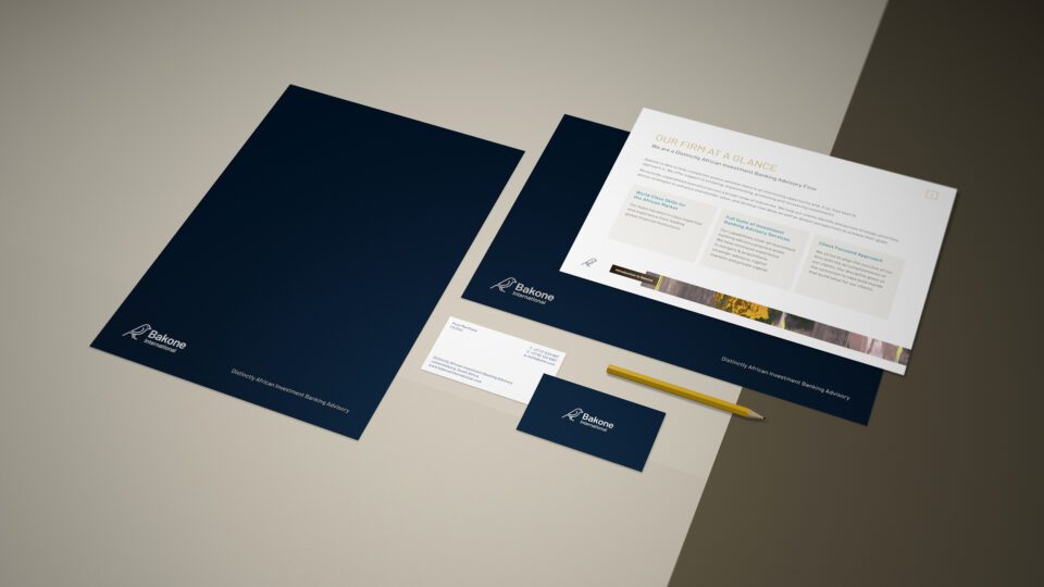
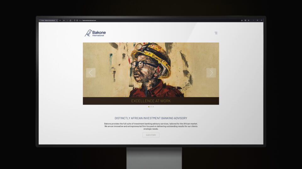
We developed a broad spectrum of symbol design options as part of the exploration process. We started with linocut style illustrated icons and further refined with client feedback. The abstraction led us to a more minimal line version of the finch rendered in dark blue. This became the brand icon which was paired with contemporary humanist type. We developed a memorable colour palette which used a gold hue as a contrast to the dark blue. From this, we developed further shade combinations along the same hue values; a darker caramel, a dark brown and a charcoal. We then worked together with the client in commissioning unique artworks which supported the brand aesthetic. These paint based illustrated brand assets feature in two ways: Firstly as a series of character portraits to be used in key image containers in the website, comms and designed materials. Secondly, the design toolkit contains painted abstracts which are used in backgrounds and other secondary and ambient use cases.
The Results
The result is a warm brand which is rooted firmly in the African landscape yet with all the supporting contemporary brand triggers which ensures its global relevance and standing.