the client
Cashzone is a trading brand of Cardpoint Services Plc. Established in 1999 they own 1 in 10 UK ATM’s within the UK. A footprint which far exceeds any single bank or building society. The Cashzone network manages 100 million transactions a year with up to 220,000 transactions processed per peak hour.
The Brief
Cashzone had lost a lot of its brand identity equity from being repeatedly bought and sold over the years. Marketing and brand values had always played a bit part both within the business and the sector as a whole. An opportunity exists for a new high street brand which not only severs perceptions from the past but paves the way for a fresh, dynamic and respected entity – in short, to create a strong and consistent ATM brand that has real stand out and trust.
The Solution
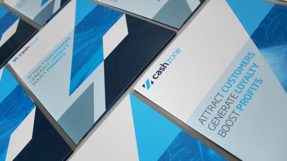
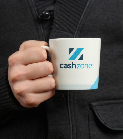
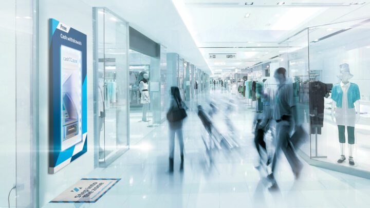
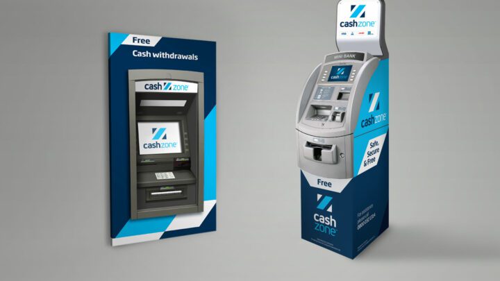
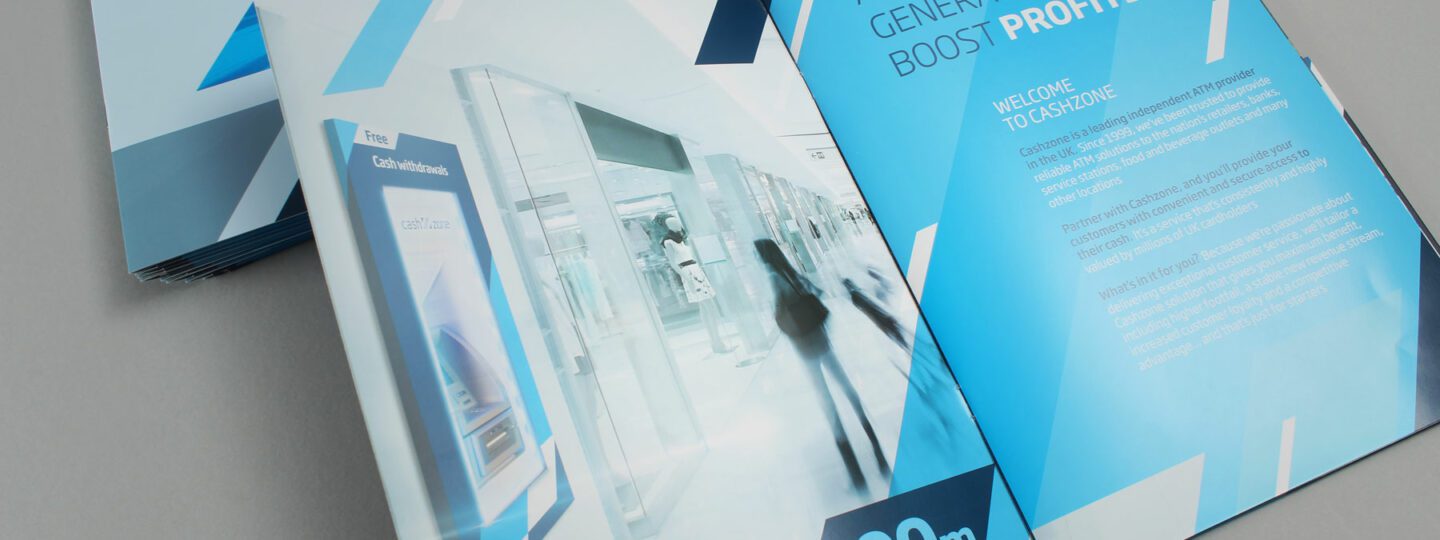
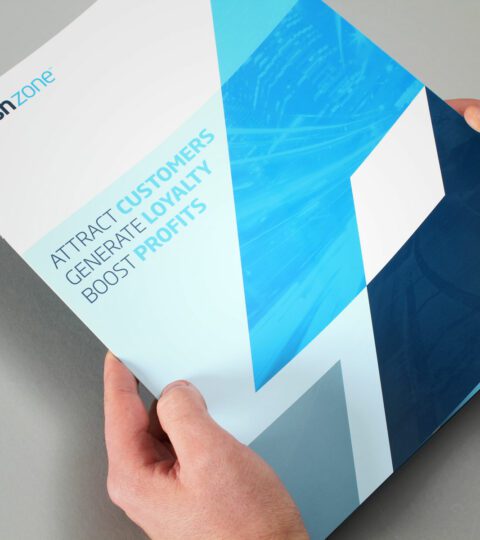
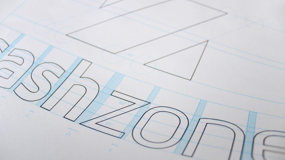
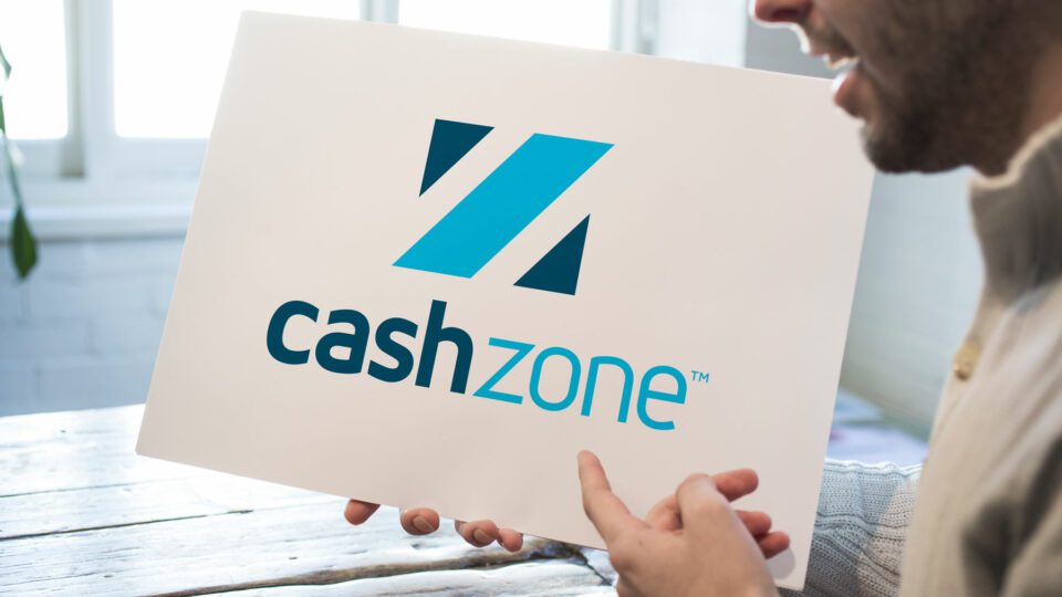
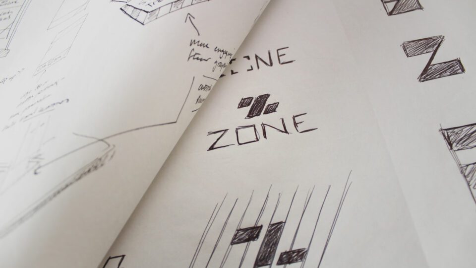
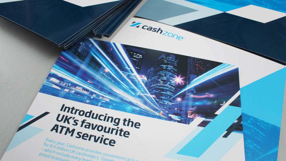
The previous brand identity applications were very generic with no ownable visual look and feel. To create a prominent high street brand Cashzone needed a powerful and memorable aesthetic. We looked toward the emergency services and their high impact livery. We quickly realised upon the common usage of a striking repeat graphic pattern – a gestalt. With Cashzone, we adopted a flexible and unique chevron graphic device which could be applied to all materials. This ensured a memorable brand with high consumer recall. The ATM livery language was tested with ATM users to ensure stand out from direct competitors and the main high street banks. The chevron device was used across all collateral from machine liveries to corporate literature, stationery and print advertising.
The Results
The new brand identity is out on the street and has been met with great success with a series of large signed business to business contracts. The machines which have been re-branded have seen between a 10 – 20% increase in transactions.