the client
Greenpoint Capital is a specialist in Southern African Private Credit. Their purpose is to provide capital solutions for Southern African businesses. With the result of generating attractive risk adjusted returns for their clients.
The Brief
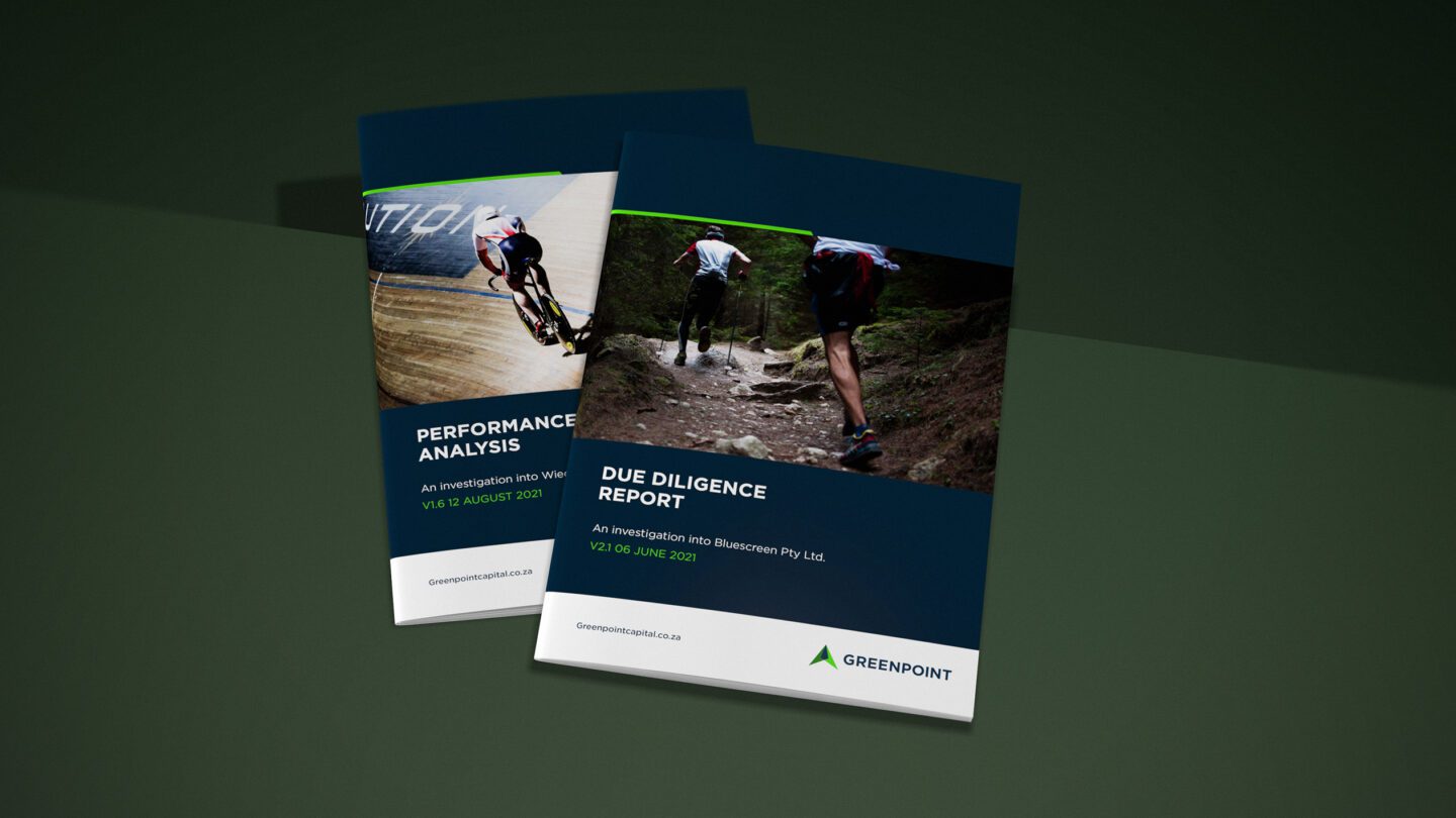
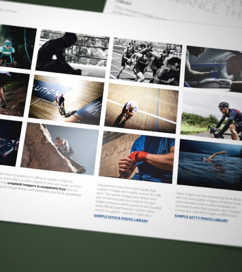
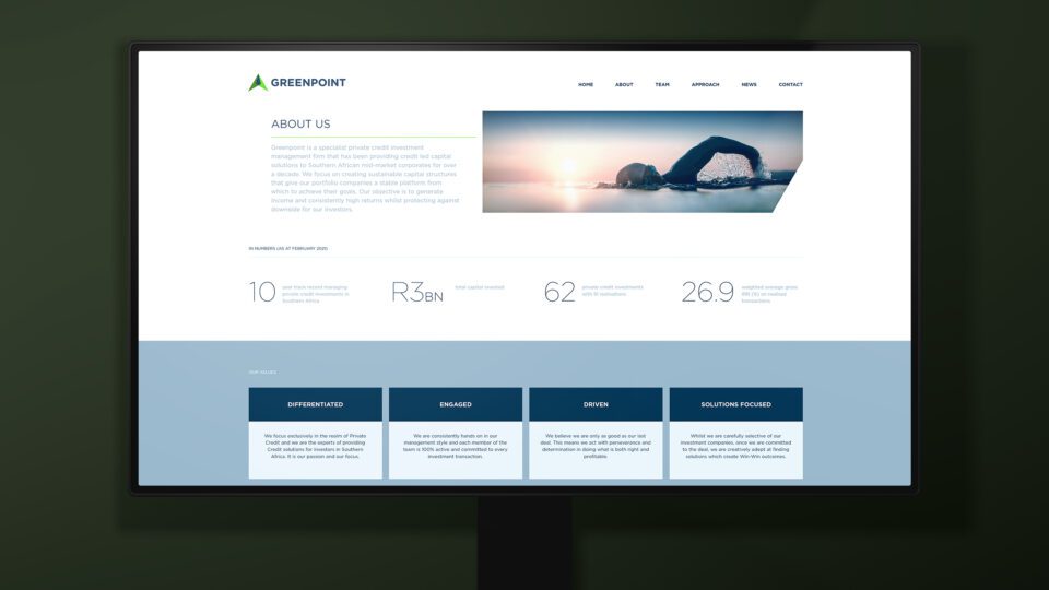
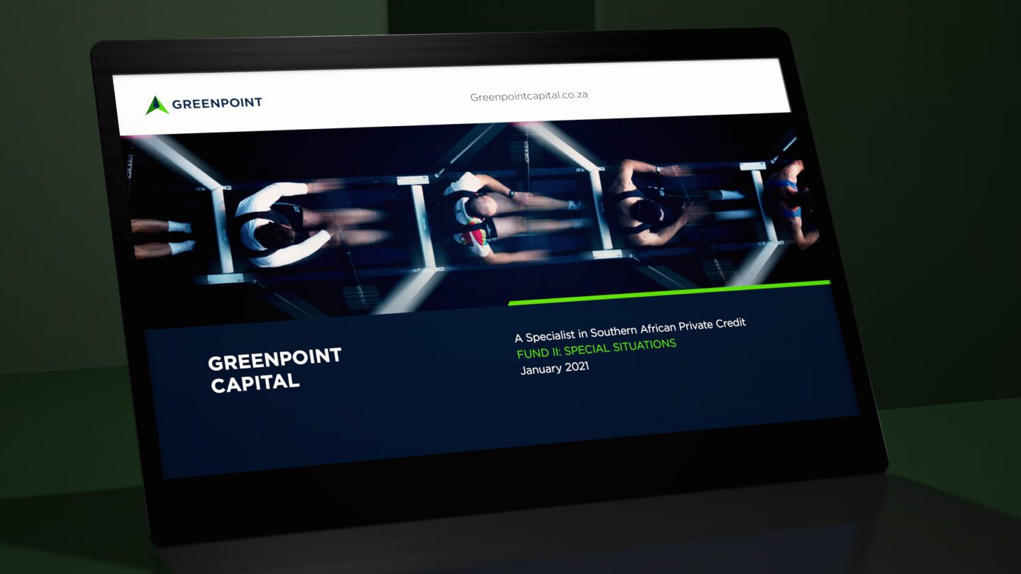
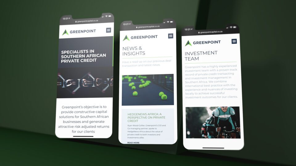
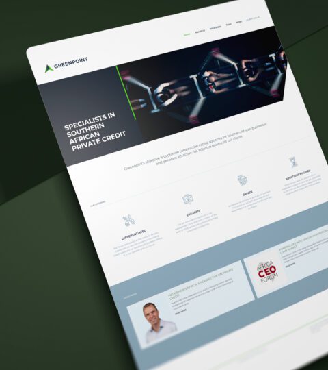
Firedog was briefed on taking what used to be a basic startup brand and in turn gear it for an international audience. Greenpoint has grown rapidly and the brand needed to match their unique offering. Whilst Greenpoint Capital (GPC) are specialists in the local South African market, more and more international investors are looking to alternative asset classes for dynamic growth and diversification. Greenpoint act as local experts in the sub-Saharan Private Credit market. We delivered a brand refresh, supporting visual identity, new image language, business communications and a responsive web design utilising the Elementor on WP platform.
The Solution
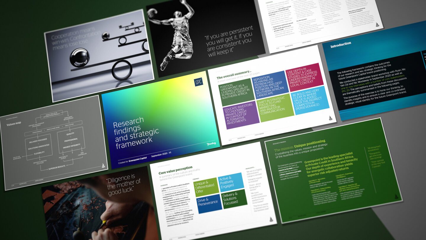
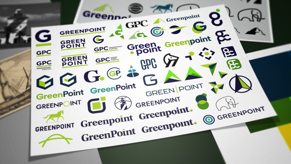
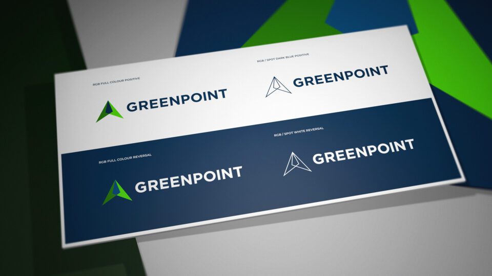
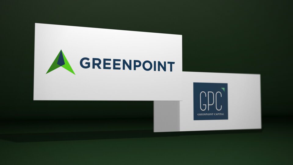
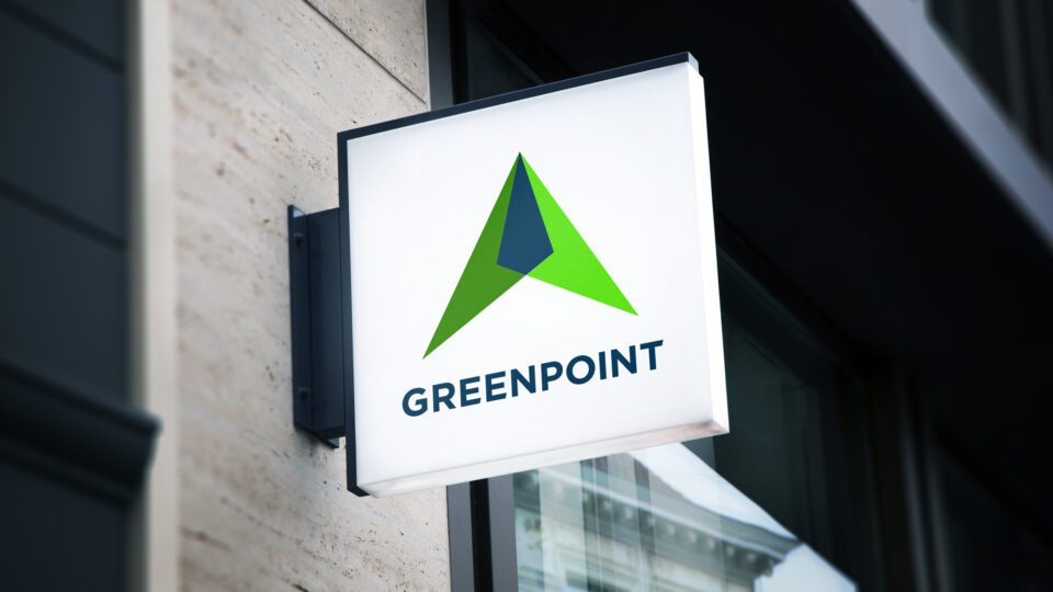
The previous brand relied to heavily on the acronym of GPC which gets lost in the broader context. We pivoted on to the Greenpoint name and thus built a name far easier to remember and recall. Greenpoint comes from the firm's origins, being the location of their very first office in a sun-kissed neighbourhood in Cape Town's Atlantic seaboard. We studied the history of the region to see where we could extract a positive associated value. The suburb is guarded by well known Lion's Head - a key landmark for both locals and travellers. We wanted to use the mountain icon but in a far less obvious (and how very financial services) way. We introduced the proposition of "Point" being a directional and upward moving device. Then we combined the idea of a peak together with a compass marker in a new and interesting way. We created a complimentary colour palette based on the Sea and Mountains - Thus, a range of greens and moody blues.
The Results
The new brand leverages the firms nine year track record and directly empowers Greenpoint Capital's ownership of the Private Credit category.