the client
Liquid Telecom is the leading independent data, voice and IP provider in eastern, central and southern Africa. It's network spans over 50,000km of fibre optic, satellite and international carrier infrastructure for Africa's largest mobile network operators, ISPs and businesses of all sizes. The Liquid Telecom Group has operating companies across the continent in Botswana, the DRC, Kenya, Lesotho, Rwanda, South Africa, Uganda and Zambia, Zimbabwe and the UK.
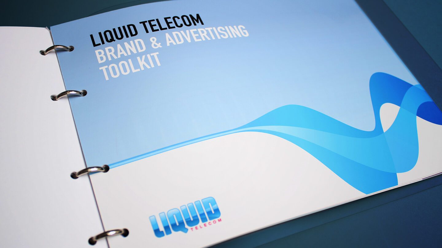
The Brief
Firedog has worked with Liquid Telecom for a number of years and brand evolutions. Most recently, we were asked to refresh the telecoms brand identity in line with a change in business strategy. Liquid have moved from a purely retail telecoms offer to a far more infrastructure and fibre telecoms offer, now heavily involved in creating fibre and satellite networks across sub-saharan Africa. The new identity needed to stay true to its heritage, yet align to the new business product values. In addition, the brand has come under competition from a number of informal operators, and thus the brand needs to convey qualities of control and order.
The Solution
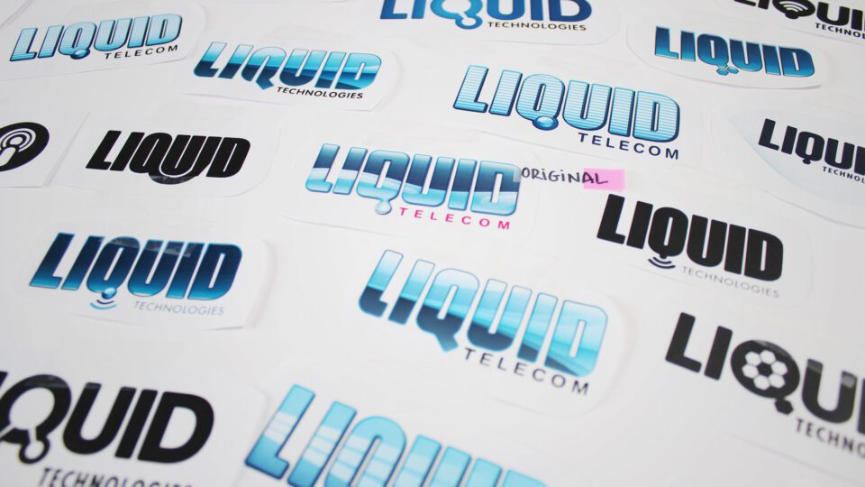
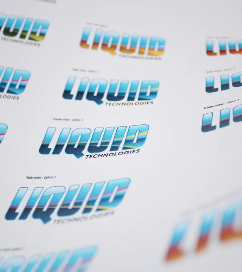
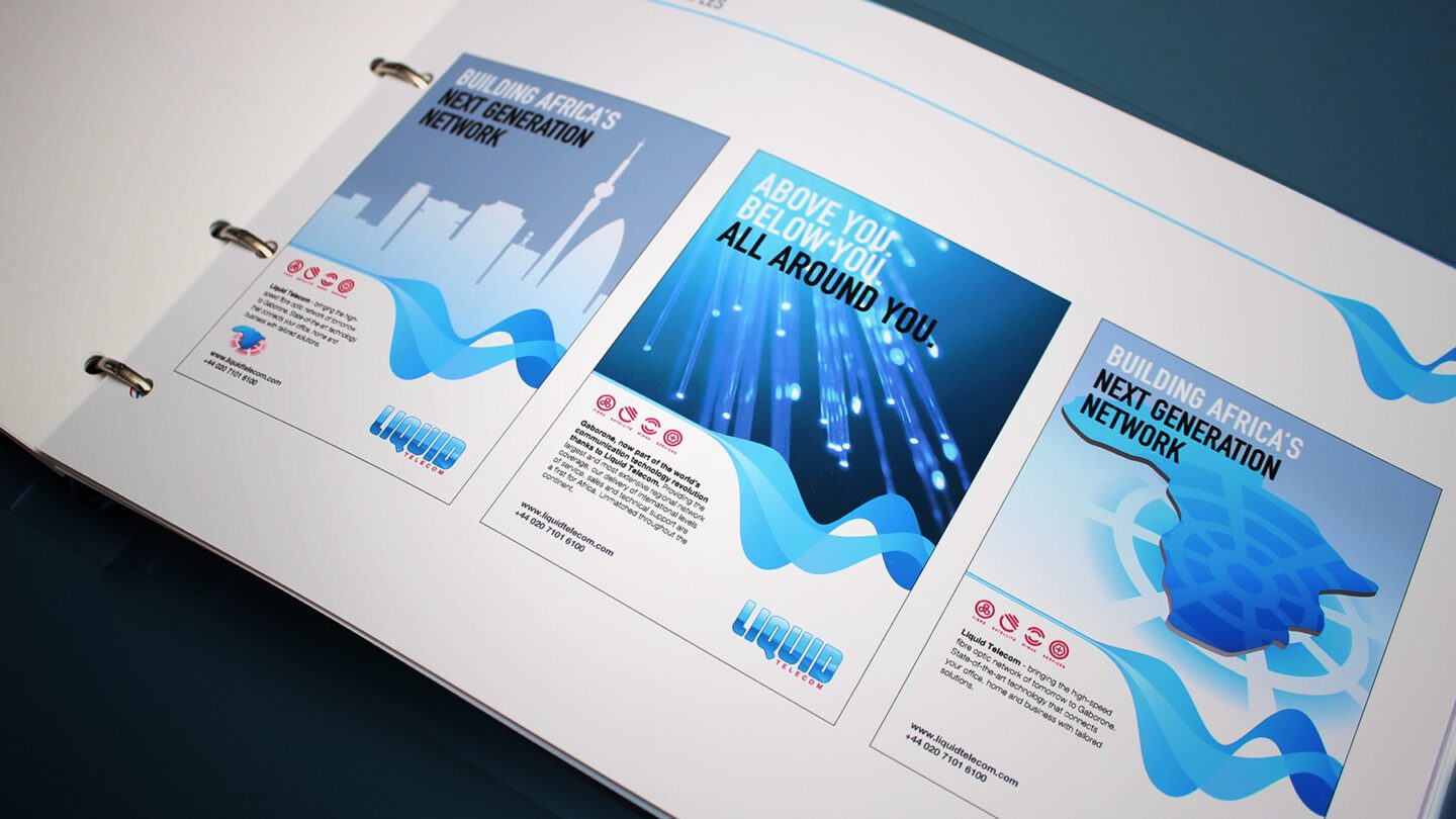
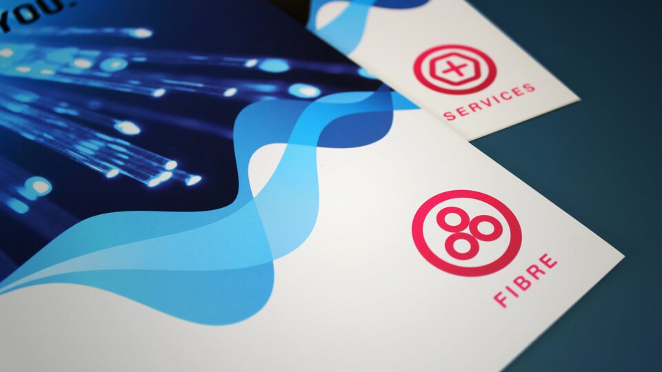
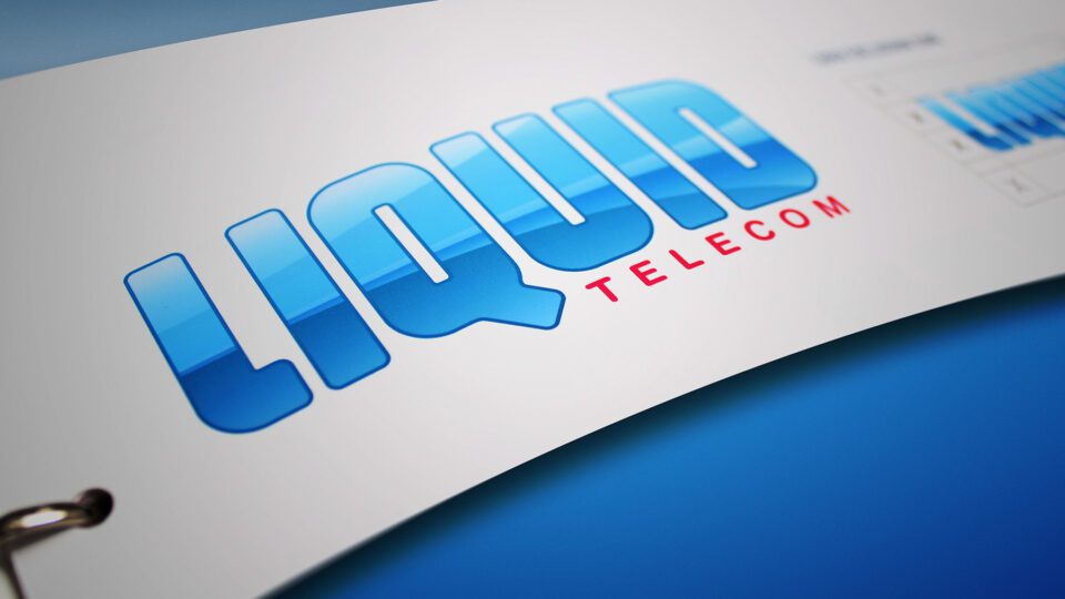
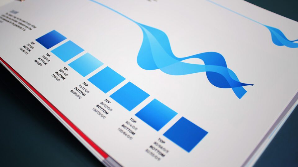
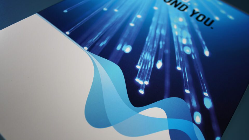
The refreshes telecoms brand identity icon utilises an almost identical typographic footprint to the previous brand. We pulled back on the liquid look and feel (Somewhat confusing in the African markets, where it has been confused with water utility businesses). The new brand contains an abstract fibre device which conveys the new business offer. We retained the blue brand colour, which has proven to be highly recognisable across the brand applications. To support the new brand we have developed a graphic flow-like supporting visual language, a new imagery look & feel and a comprehensive toolkit which covered applications such as above the line advertising, events and vehicle graphics.
The Results
Liquid Telecom continues to dominate it’s markets and has been awarded Best African Wholesale Carrier six years in a row. The brand brings a level of perceived quality which the competition is finding a challenge to match.