the client
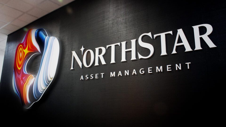
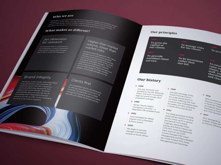
Northstar is a Cape Town based asset manager which provides specialist solutions for discerning investors. Their investment process is built upon an obsession for research applied to a limited number of meticulously managed portfolios.
The Brief
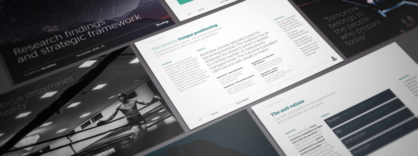
We were tasked with elevating the brand over the competition. The previous positioning of the “life journey” too generic as a sector positioning. This “long term investing” so common in the competitor environment, is just an inward ruse to get clients to forgive underwhelming performance in the short and medium terms. We needed to pivot and find a unique angle.
The Solution
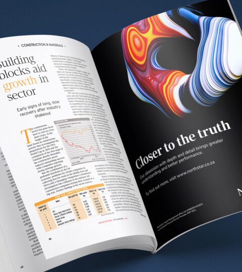
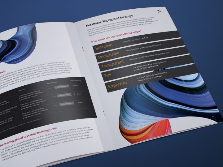
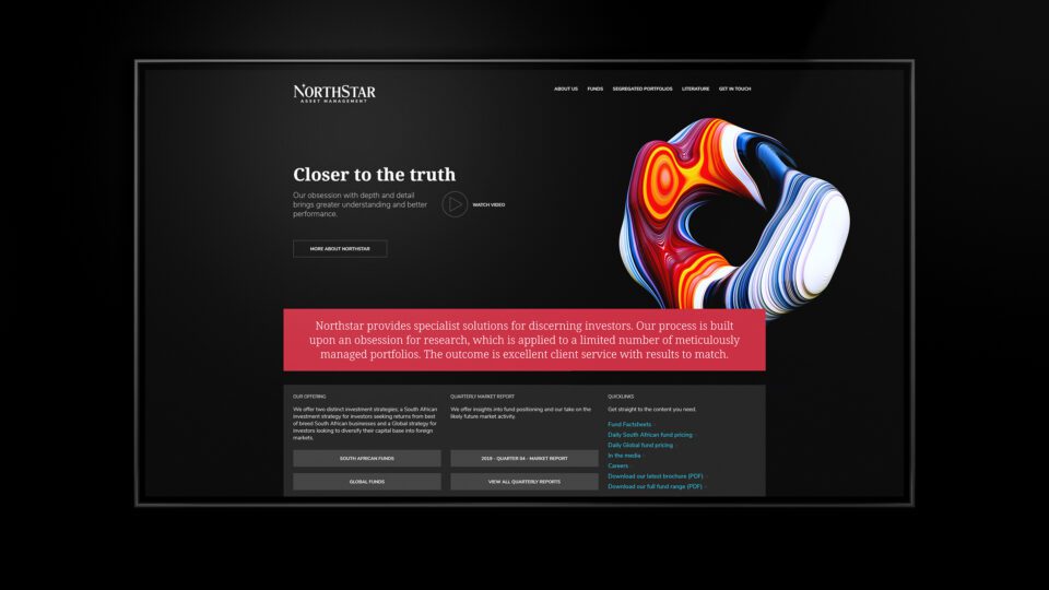
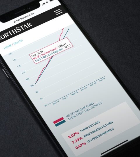
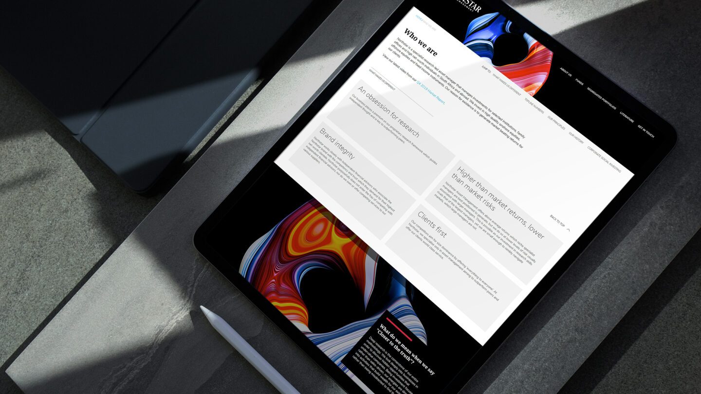
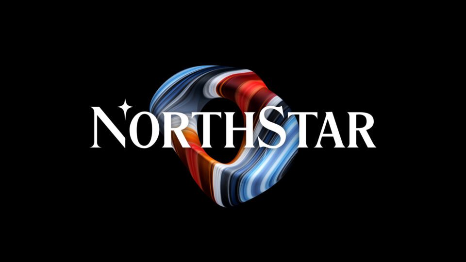
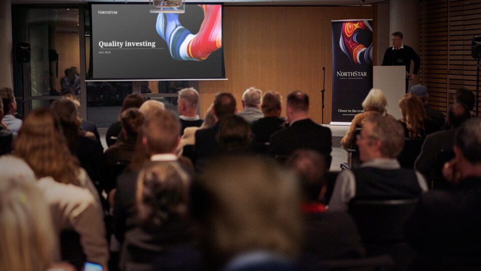
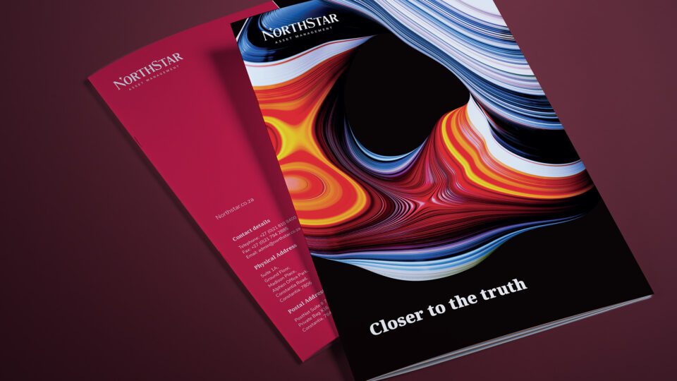
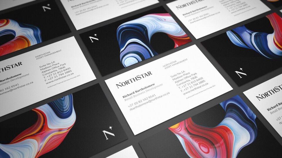
Northstar offers a much narrower focus through a limited number of tactical funds, yet each of their funds is far more meticulously researched and managed. The nature of this deep dive led us to seize upon the positioning of “Closer to the truth.” The truth being factors which become unearthed after careful interrogation and relentless study. We explored visual narratives which expressed a close-up perspective. We struck upon minerals and cross sections of natural materials observed at high levels of magnification. We connected this with esoteric understanding which could only be accessed from deeper research, intelligence and shrewd discovery. Northstar often buys into undervalued stock through confidence of research and we felt our visual identity expressed this journey in a non-obvious and intriguing way. The website not only carried fund information but also used custom coded Java based charting applets; Time horizons, performance and returns are all automatically generated in the front end. We greatly optimised the overall browsing UX by consolidating what was very disparate journeys all into single key fund pages which contain all the relative information in one page. We built a smart anchor based in-page navigation system which allowed for a reduction of page count by over 50% with no loss in perceived depth.
The Results
The resulting fund management brand identity and website represents a marked differentiation from the sector competition and cements the research proposition into the minds of the core audience.