the client
PolarStar are commodity investors specialising in relative value strategies. They blend fundamental and quantitative expertise to produce returns which have low correlations to major market indices.
The Brief
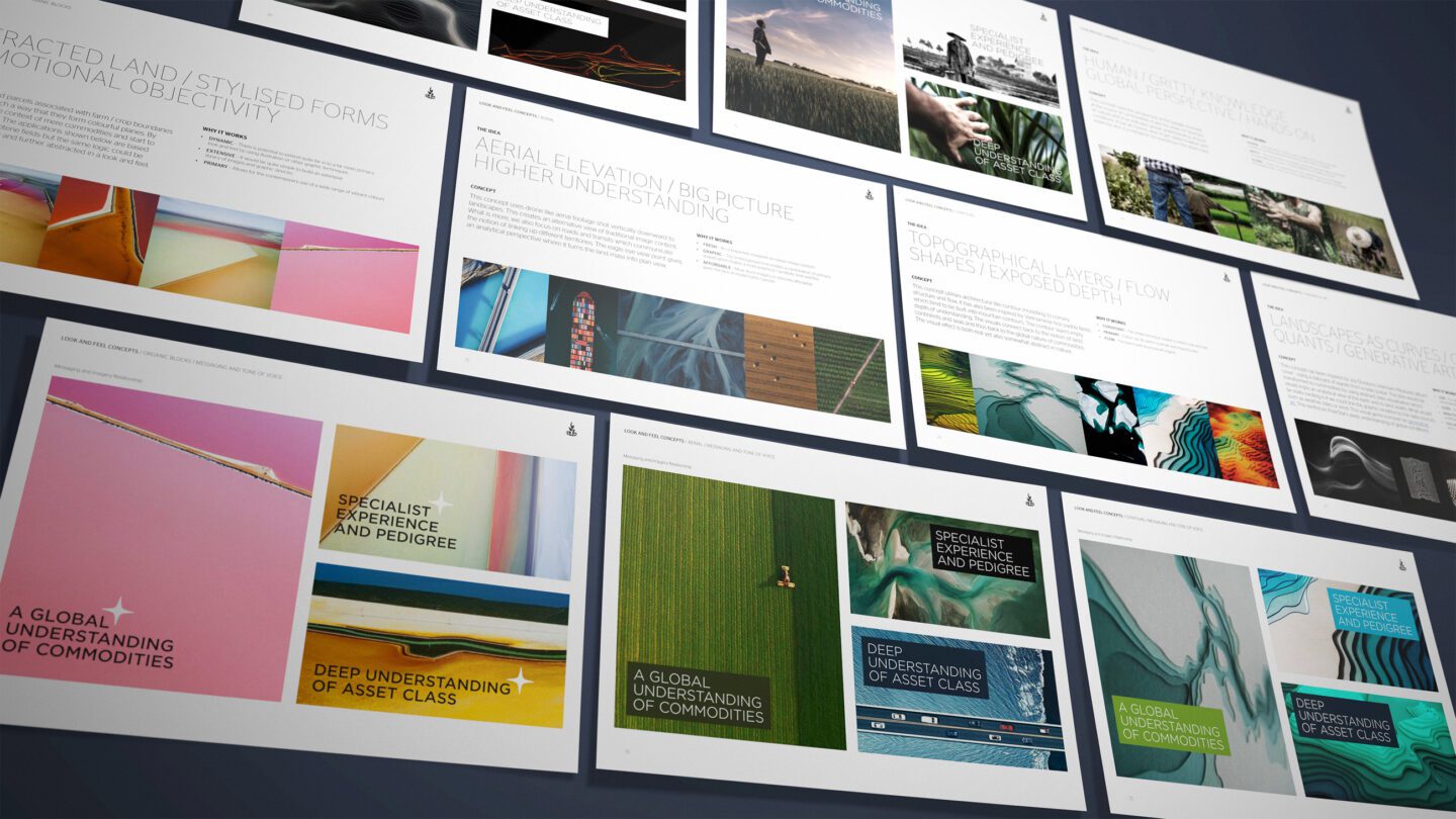
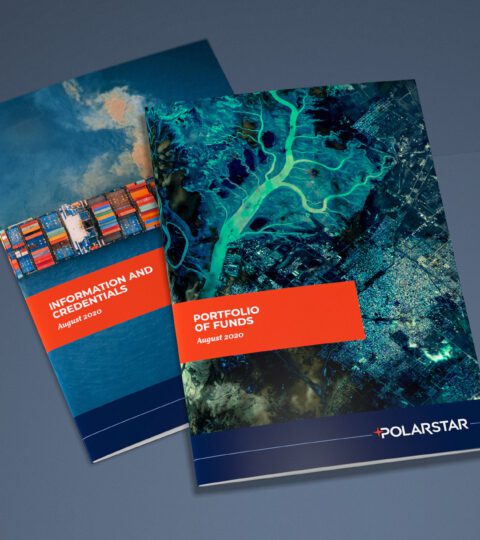
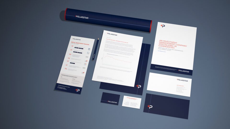
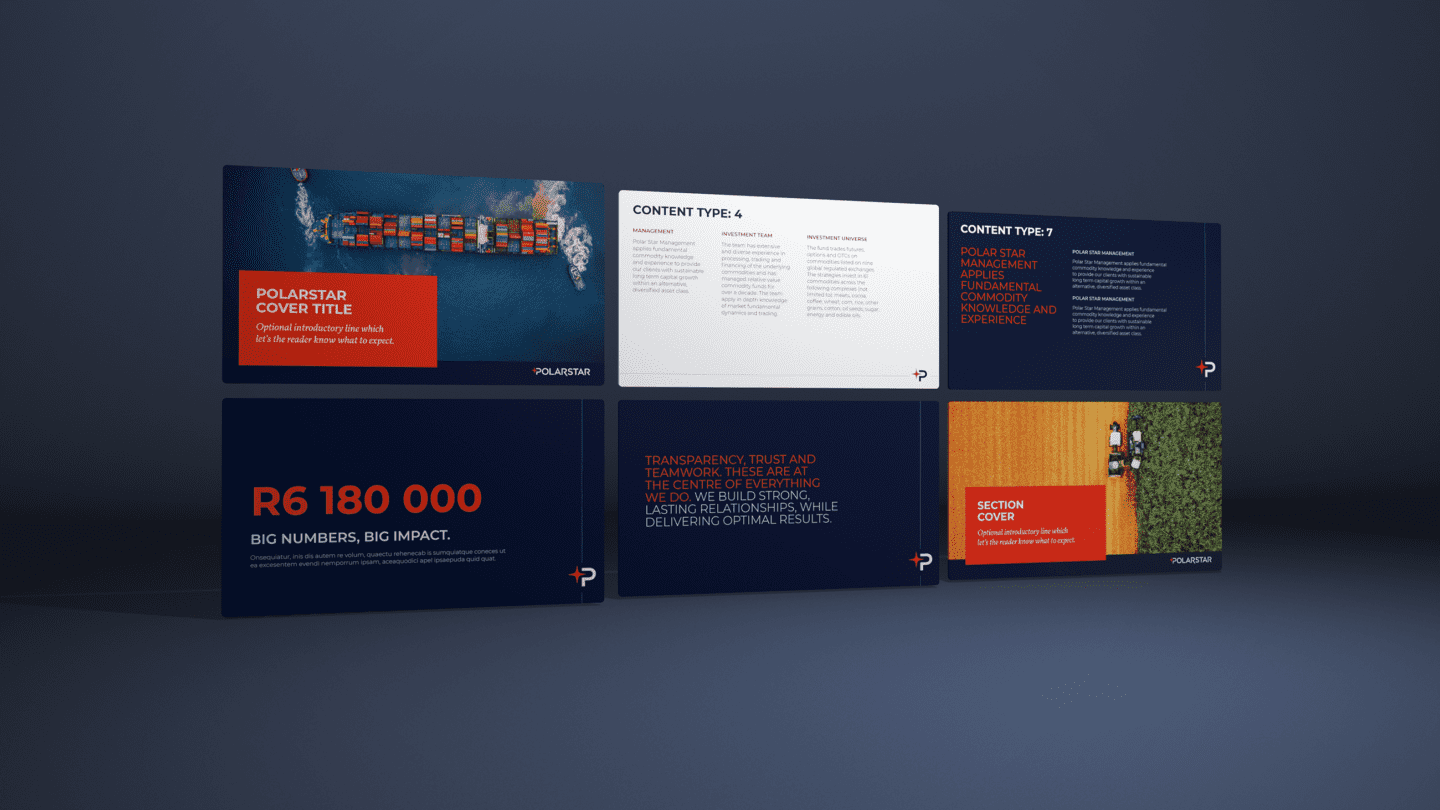
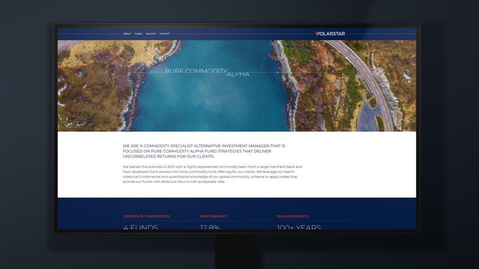
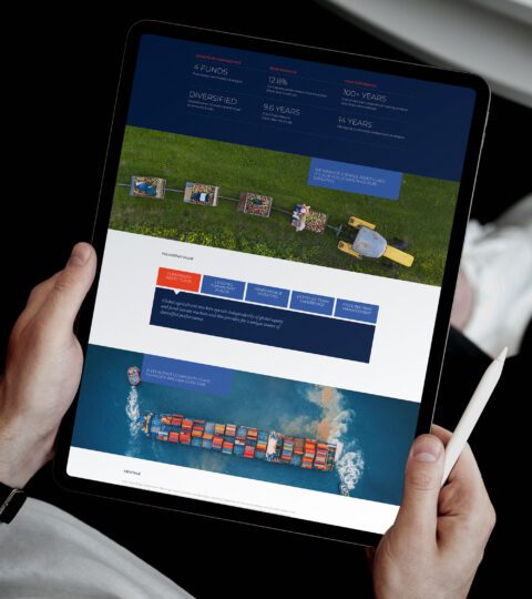
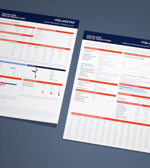
We were briefed on taking an existing brand and building a far more solid, bold, and consistent identity. We delivered research, strategic framework, brand and visual identity system, supporting collateral and communications design and a new website.
The Solution
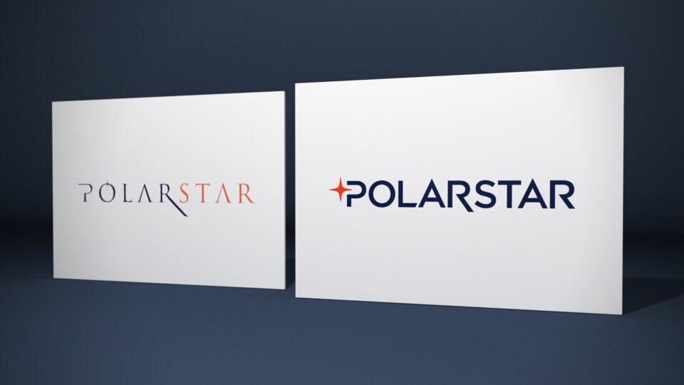
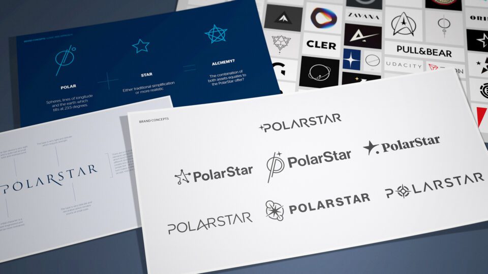
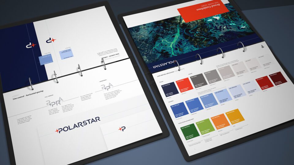
We ascertained that the PolarStar brand reputation and category recall is strong, yet the incumbent branding contained an inconstant proposition and a weak brand and visual identity system. Our brief was to build a dynamic yet formal brand to take on the most established European and American institutions. We studied the market and competitive landscape, went through the target audience behaviours, analysed the onboarding brand experience. We established that credibility and longevity is a required perception in a sector that has been through a large amount of attrition and upheaval. We strengthened the overall feel of the brand mark and cut back on embellishment in order to convey a strict sense of unity and control. We developed a stronger colour palette which combined a deep anchor blue colour offset by a vibrant and internationally positioned warm red colour. The resulting identity uses this strong colour and a clear / simple visual system which ensures a perception of capability and class.
The Results
The new brand and online experience far exceeds the capabilities of the incumbent brand and now positions the business as an eminent specialist in their field.


