the client
Regarding Capital Management / RECM, a leading independent financial brand and asset management firm.
The Brief
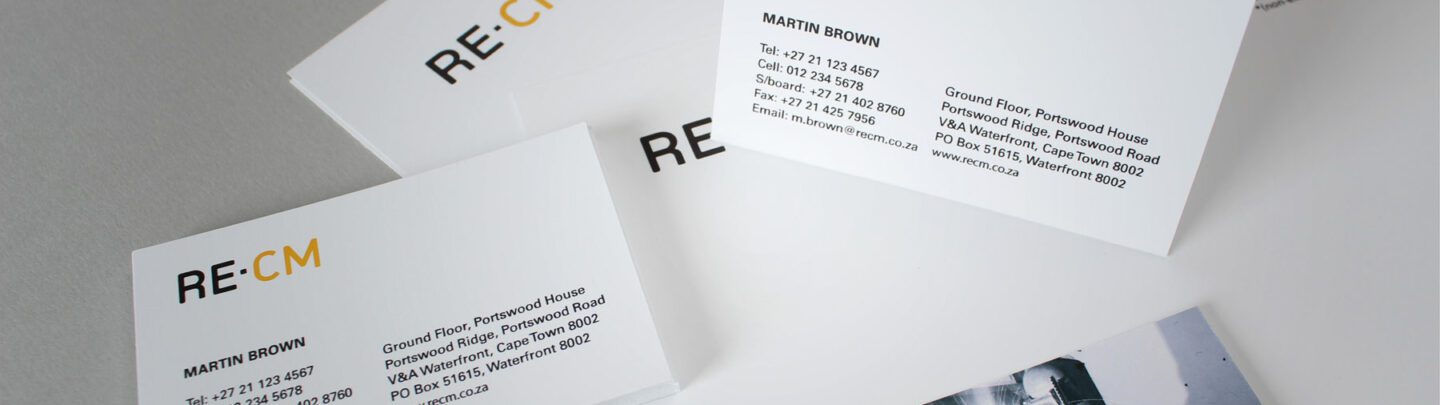
RECM is unlike many fund management companies. They are to the point, do not like to boast and want intimate relationships with a small amount of clients. They believe it is not always wise gaining clients rapidly. If you’re confident enough, clients will choose you, rather than the other way round. Firedog’s brief was to create a financial brand that reflected these values within the company, yet retained the equity that already existed.
The Solution
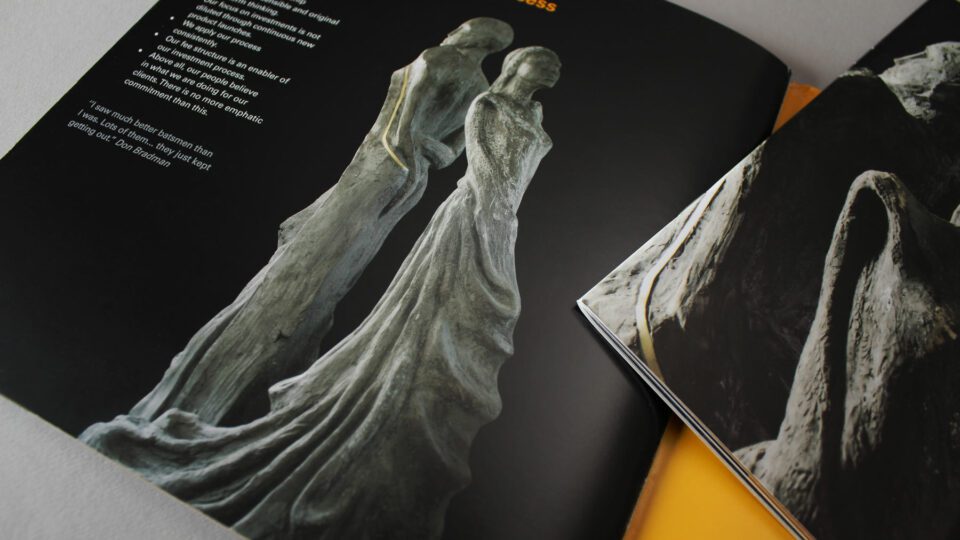
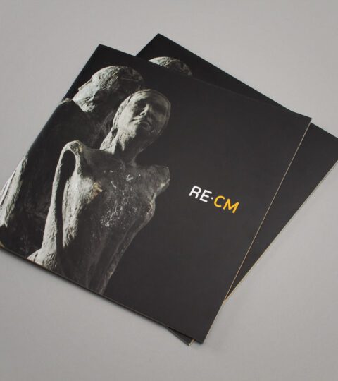
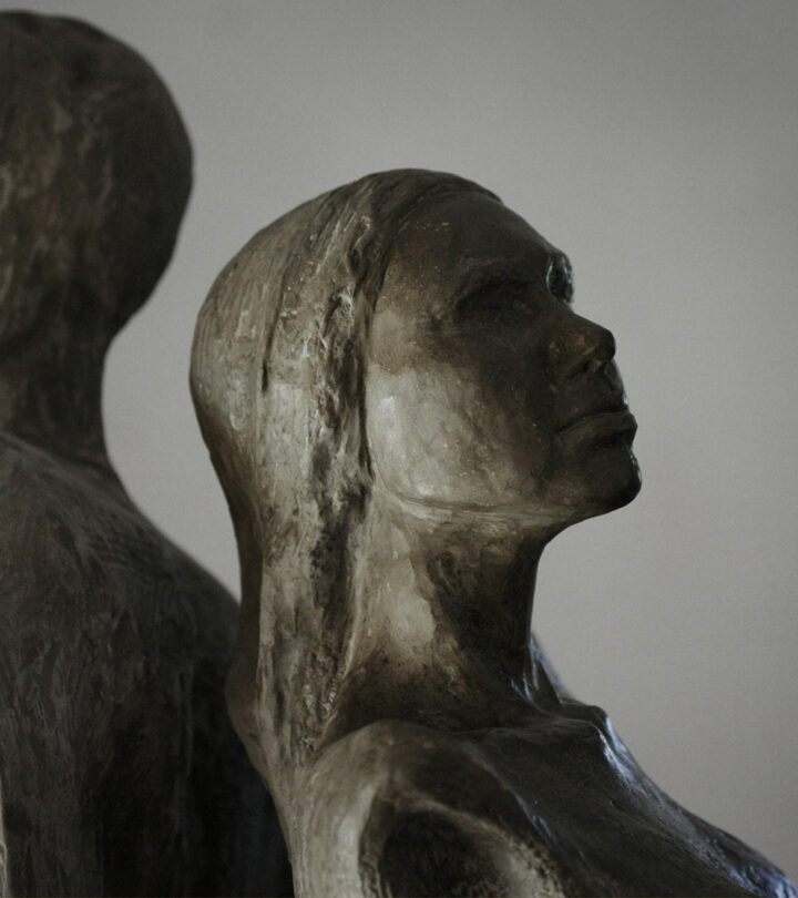
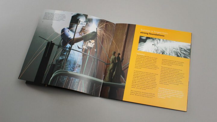
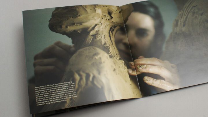
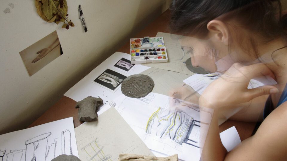
Considering the profile of the client’s investors, we felt that the brand look and feel needed to not only have a premium feel, it also required a visual communication at an intellectual level. We decided on using a strategy we have termed as the ‘brand story’. We decided on creating a close visual metaphor by documenting a creative process that we could then align to the RECM brand values. As the value of art collections in boardrooms is also greatly respected, we decided that an undiscovered sculptor (yet with great potential) who was tasked with the creation of a piece of art would add great value to the financial brand. We sourced an up-and-coming artist, Marieke Prinsloo and documented the creation of her sculpture over a three week period. This involved interesting phases such as ironworking, welding, silicon moulding and concrete fabrication. The result is a look and feel firmly rooted in reality and is beautifully natural in its creation and although the imagery was generated in the apple growing regions of the Cape, it translates well to RECM’s international markets.
The Results
The final piece has also been placed in the RECM headquarters in Cape Town and is guaranteed to accrue value over time – a testament to the brand story concept.